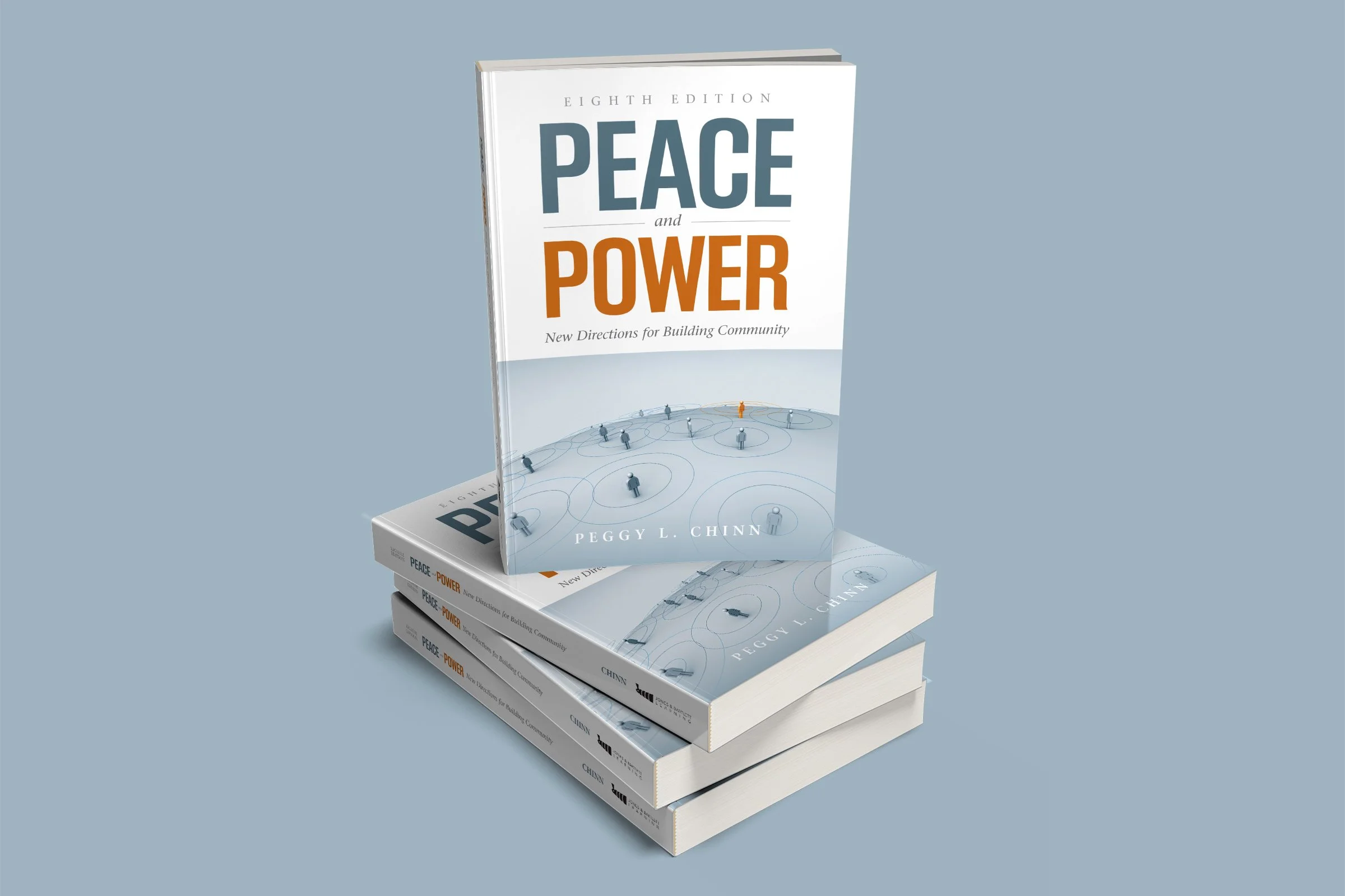
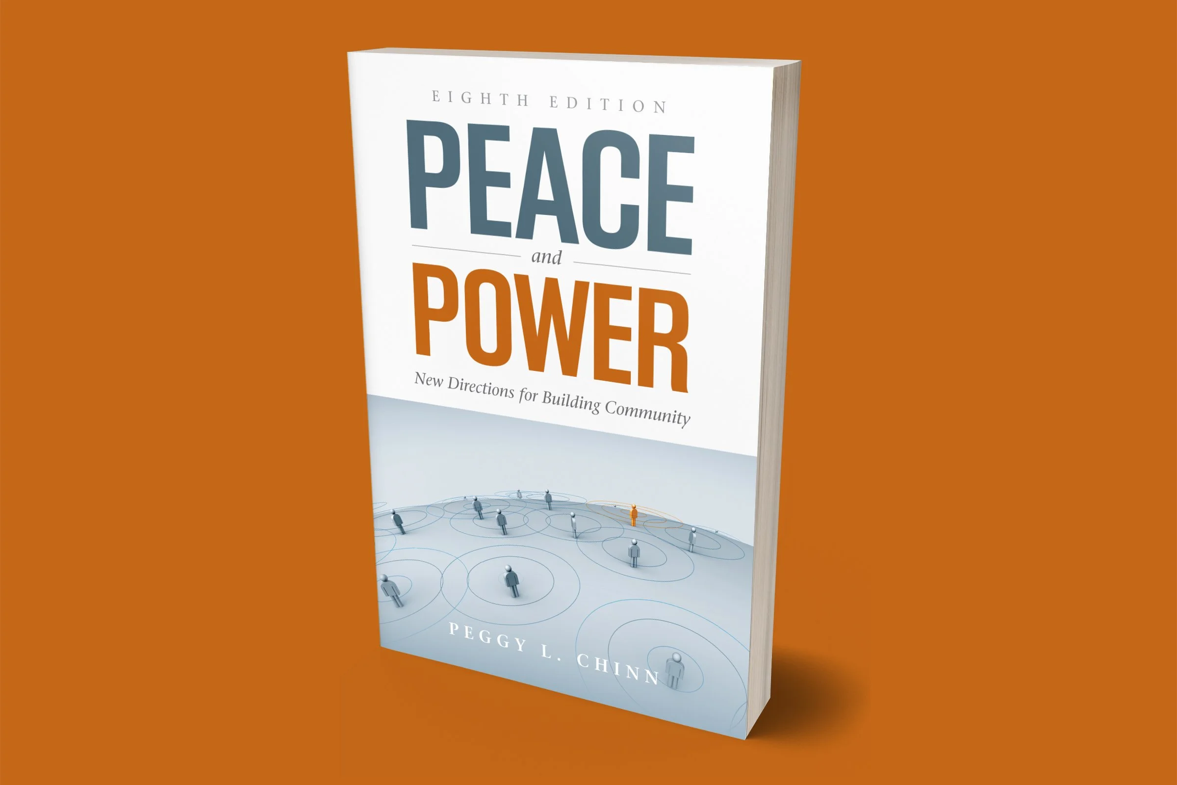
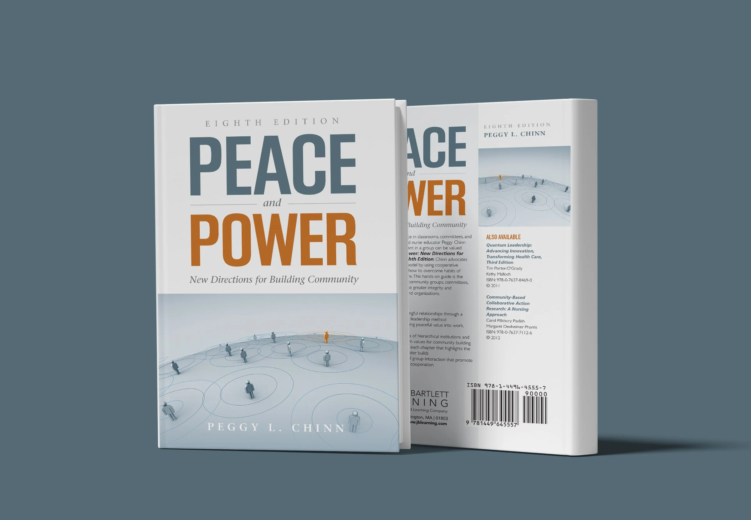
Peace and Power, Eighth Edition
Best in Category, Cover/College, 56th Annual New England Book Show 2013
I used blue for the calm aspect of peace, and a rust color for the strength of power. The illustration shows the community rallying around a powerful figure in the center where they are beginning to converge.
Judges Comments
“Elegant. Clear, bold, and balanced typography. Power typography, and illustration and design do not attempt to overdo or overillustrate the subject. Nice back cover, clear. Nice use of repetition of title on the back cover.”